
Your monthly SEO meeting starts the same way. Someone opens a spreadsheet, someone else switches to Google Search Console, and a third person checks Google Analytics 4 to explain why the numbers don't line up. Rankings have changed, organic traffic looks healthy, and impressions are moving, but nobody can answer the question that matters: what decision should we make next?
That's the problem customizable SEO dashboards are meant to solve. A useful dashboard isn't a prettier report. It's a decision system that connects search visibility, user behavior, technical conditions, authority, and conversions in views built for the people using them.
Table of Contents
- Why Most SEO Dashboards Fail to Drive Action
- Choosing KPIs That Match Stakeholder Decisions
- Mapping Data Sources Without Breaking Trust
- Designing Layouts and Templates for Every Team
- Automating Updates Alerts and Validating Impact
- Putting Your Customizable Dashboard Into Practice
Why Most SEO Dashboards Fail to Drive Action
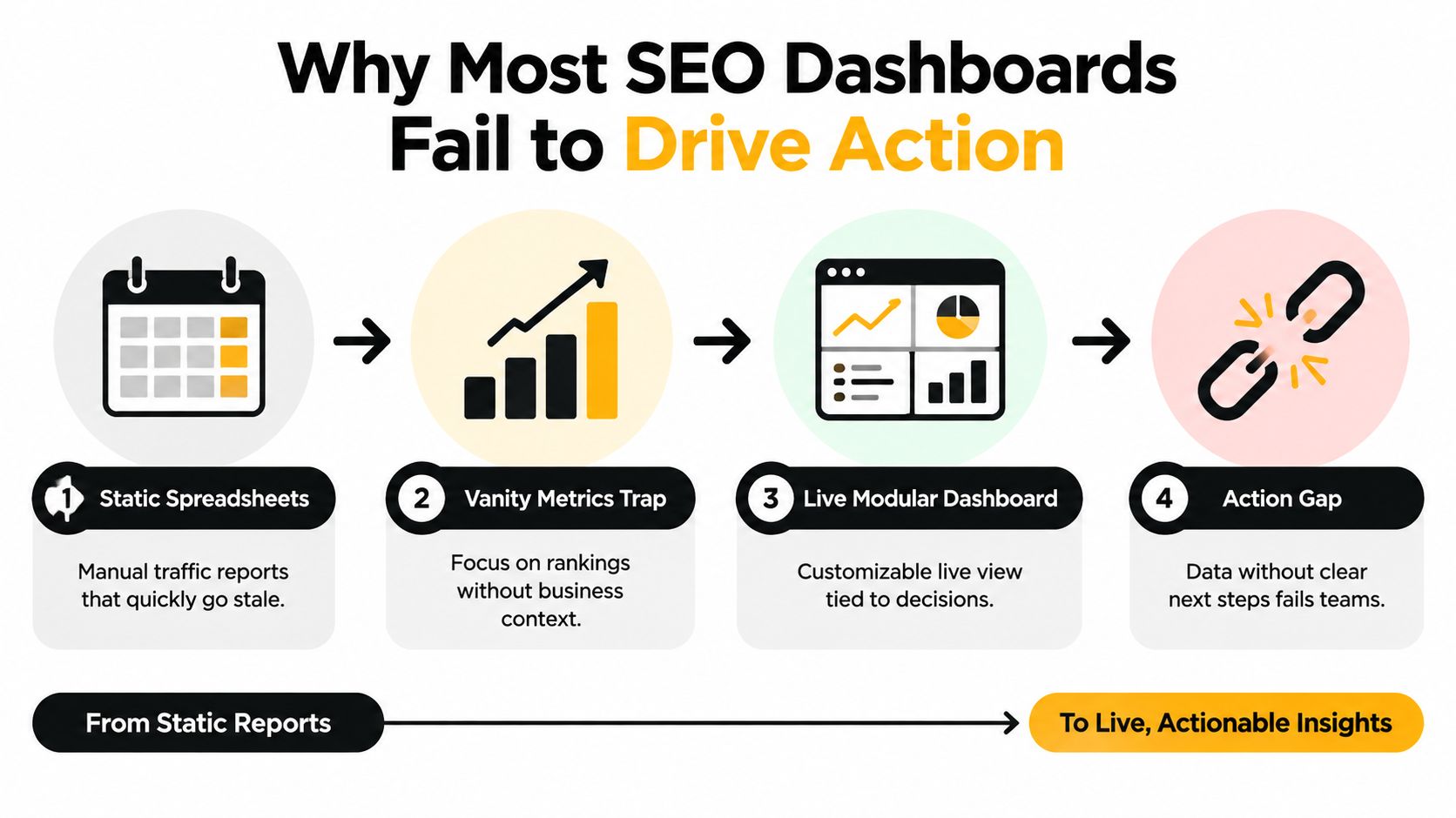
The failure usually starts with a reasonable request: “Put all our SEO data in one place.” The team connects Google Search Console, Google Analytics 4, a rank tracker, backlink data, Core Web Vitals, and conversion events. The resulting dashboard looks thorough. It also gives an executive, a content strategist, and a technical SEO specialist the same crowded screen.
That setup reports activity without assigning responsibility. A marketing leader sees impressions and rankings but can't tell whether organic visitors became qualified leads. A content strategist sees traffic but not which pages support high-intent journeys. A technical specialist sees performance signals but has no direct view of the pages or conversions affected by a fix.
Modern dashboard examples increasingly treat the interface as a multi-source reporting layer, bringing together Search Console, GA4, keyword rankings, backlinks, Core Web Vitals, and conversions. Template libraries also emphasize modular widgets, drag-and-drop layouts, hidden or visible components, and separate tabs for organic visibility, traffic, and conversions, as shown in Databox's SEO dashboard examples. The important shift isn't the number of integrations. It's the ability to shape the same underlying data around a decision.
A report answers what happened
A report might show that clicks fell for a group of pages. A decision system helps the team determine whether the cause is a ranking change, a demand shift, a technical issue, a weak search snippet, or a change in conversion behavior.
That requires more than a chart. It requires:
- A defined audience: Executives, practitioners, and content or technical teams need different levels of detail.
- A controlled view: Date range, country, device, brand segment, and page group should be explicit rather than implied.
- A traceable action: A metric movement should lead to a page, query, template, technical issue, or experiment someone can own.
- A business connection: Visibility and engagement need a path toward conversions, qualified leads, pipeline, or revenue.
Practical rule: If a widget doesn't change a decision, help explain a decision, or validate an action, remove it from the primary view.
The best dashboard workflow starts with stakeholder questions, not available connectors. “Are our priority pages attracting qualified demand?” produces a different layout from “Which technical issues need triage?” Once those questions are clear, widget selection becomes much easier, and the dashboard stays lean enough to use.
Choosing KPIs That Match Stakeholder Decisions
A dashboard metric earns its place by helping someone choose what to do. Start with the decision, then select the smallest group of indicators that provides enough evidence to act.
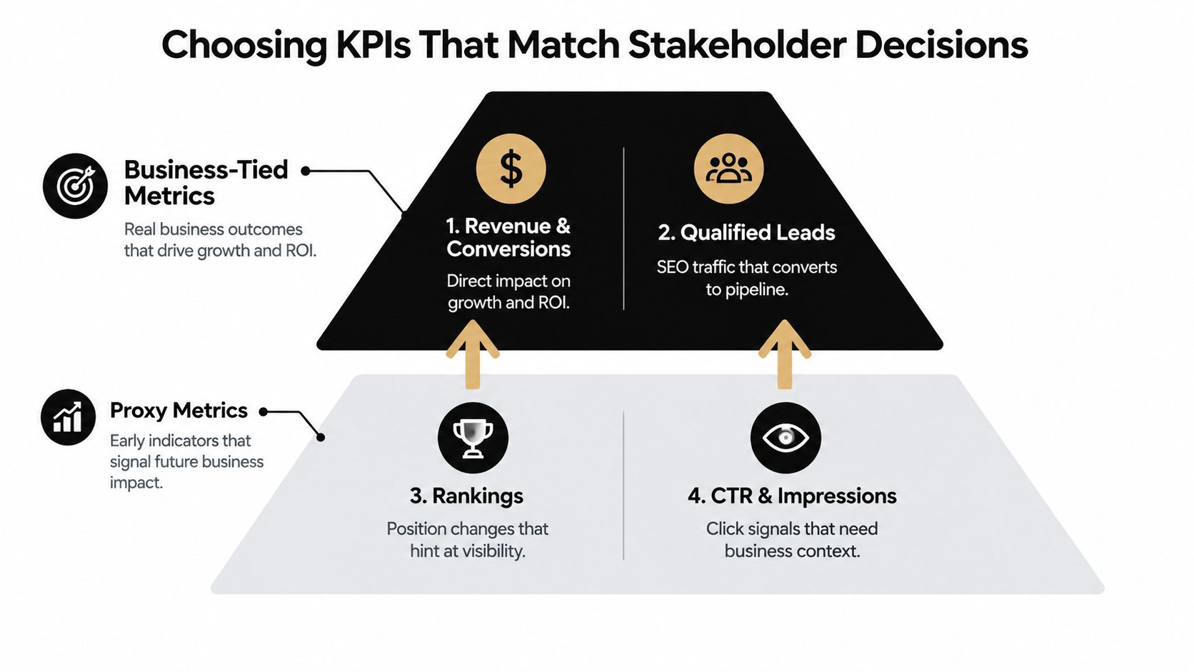
For an executive audience, the primary question might be whether organic search is contributing to growth. The view should therefore lead with conversions, conversion rate by traffic source, assisted conversions, and high-intent query performance. Search Console clicks, impressions, rankings, and CTR can provide context, but they shouldn't carry the business narrative alone.
For an SEO practitioner, the question is usually more operational: which pages, queries, or technical conditions deserve attention? That view can give more space to query and page tables, ranking movement, landing-page performance, Core Web Vitals, backlink changes, and conversion outcomes attached to affected page groups.
Content teams need a different cut. They might ask which topics attract relevant demand, which pages satisfy search intent, and which content should be refreshed, consolidated, expanded, or supported with internal links. A content view should connect query groups and landing pages with engagement and conversion behavior instead of rewarding traffic volume by itself.
The distinction between business-tied and proxy metrics matters. StrategyC's SEO marketing dashboard guidance notes that rankings and CTR are proxy metrics and don't reliably explain business impact. It recommends adding assisted conversions, conversion rate by traffic source, and high-intent query performance so the dashboard supports action rather than merely displaying visibility.
Build KPI groups around jobs
Use a simple hierarchy:
- Business outcomes: Conversions, qualified leads, assisted conversions, conversion rate by source, and revenue-linked outcomes where the data model supports them.
- Engagement evidence: Landing-page behavior, progression through key journeys, and the quality of organic sessions.
- Search proxies: Clicks, impressions, CTR, rankings, and share of voice.
- Diagnostic signals: Page experience, Core Web Vitals, crawl findings, backlink changes, and indexation conditions.
The lower levels explain movement in the higher levels. They shouldn't replace them.
A dashboard also needs guardrails. Add filters for date range, country, device, brand versus non-brand intent, page group, product line, and content type where those dimensions are meaningful. Without them, a broad average can conceal the segment that needs attention. The same dashboard can then answer different questions without changing metric definitions.
For a practical reference on connecting SEO activity to measurable outcomes, use this guide to tracking SEO. Treat the dashboard as a shared language, but keep the audience's decision at the center of every tab.
Mapping Data Sources Without Breaking Trust
Most dashboard problems blamed on visualization are data-model problems. Two platforms may both use the word “page,” but one may describe a landing page, another may describe an associated URL, and a third may group records by a canonical address. Joining them without defining the reporting entity first creates attractive charts with unreliable conclusions.
Begin by writing down the entities the dashboard will track. A practical set might include domain, canonical URL, page group, query, keyword set, country, device, and conversion event. Define how each source represents those entities before connecting anything.
The recommended sequence is straightforward. Prompt Position's methodology for customizable SEO dashboards advises defining reporting entities first, connecting core sources such as Google Search Console and GA4, and blending datasets only when a decision requires it. That approach keeps page-level actions traceable and reduces false joins.
Keep sources separate until the question demands a blend
Google Search Console is the source for search queries, impressions, clicks, CTR, and Search Console position. GA4 is the source for on-site sessions, events, conversions, and traffic-source behavior. Rank trackers provide a controlled keyword set, while backlink platforms describe external links and authority-related signals.
Don't merge every source into a single table by default. A query-level Search Console dataset and a page-level GA4 dataset may not share a clean key. Instead, keep source-native views separate, then blend through an explicit mapping when the business question needs it, such as connecting a page group to conversion outcomes.
Search Console also has a known reconciliation issue. Query totals can differ legitimately from page-level totals because some queries are anonymized, so exact agreement isn't expected, as explained in Google's Search Console discussion of query and page discrepancies. Label source definitions directly in the dashboard so users don't mistake a reporting distinction for a broken connector.
This Looker Studio API resource is useful when your team is deciding how to manage connections and reporting workflows. Whatever platform you use, document owners, refresh behavior, attribution rules, filters, and known limitations beside the dashboard rather than relying on tribal knowledge.
Designing Layouts and Templates for Every Team
A dashboard should reveal the right answer in the order a person needs it. The first screen should orient the user, the next should explain movement, and the deeper tabs should support investigation.
Use a modular structure with clear audience paths. A concise executive tab can show conversion outcomes, organic contribution, priority-page performance, and material changes. An SEO operations tab can expose query, page, technical, and authority detail. A content tab can focus on topic groups, landing-page behavior, high-intent queries, and refresh opportunities.

Give every widget a job
A scorecard is useful for a small set of headline outcomes. A line chart is better for movement over time. A table is valuable when the user needs to identify individual URLs, queries, or issues. A bar chart can compare page groups, device segments, or content types.
Avoid placing an executive conversion tile beside an unexplained technical metric. Either show the relationship clearly or move the technical detail to a practitioner tab. Consistent labels matter too. “Organic conversion rate by source” gives a decision-maker more useful context than “CVR.”
| Stakeholder | Primary Question | Key Widgets | Filters Needed |
|---|---|---|---|
| Marketing leader | Is organic search contributing to growth? | Conversion outcomes, assisted conversions, source conversion rate, priority-page trend | Date range, country, product line, brand segment |
| SEO practitioner | Which pages and queries need action? | Query table, landing-page trend, ranking movement, technical issue view | Date range, device, country, page group, query intent |
| Content strategist | Which content attracts and converts relevant demand? | Topic performance, high-intent queries, landing-page conversions, engagement view | Content type, topic group, page status, intent |
| Technical SEO specialist | Which technical conditions require triage? | Core Web Vitals, crawl findings, indexation view, affected-page conversions | Device, template, page group, issue type |
Design for progressive disclosure. Keep the summary readable, then let users drill into the records behind a movement. A page-group filter should preserve the same definitions across tabs, not change the population being measured.
For teams working at the intersection of site experience and search performance, DigiVisi's user experience and SEO guide offers useful context for thinking about how usability signals belong in a broader optimization workflow. The dashboard doesn't need to show every UX detail, but it should make it possible to connect relevant page experience findings with search and conversion decisions.
Reusable templates in Looker Studio, Power BI, or a dedicated SEO platform can speed up delivery, but a template is only a starting point. Hide widgets that nobody uses, rename fields in stakeholder language, and create separate tabs for visibility, traffic, conversions, content, and technical health. For teams assessing AI reporting workflows, this resource on AI reporting tools can help frame where emerging visibility data belongs, without allowing it to overwhelm the core SEO view.
Automating Updates Alerts and Validating Impact
Automation solves the reporting burden, but it doesn't automatically create trustworthy insight. A dashboard that refreshes continuously can still mislead the team if source definitions drift, filters change, or a seasonal spike makes a routine movement look like a breakthrough.
Set refresh ownership before launch. Decide who checks connector failures, who handles missing conversion events, and who reviews unexpected changes in row counts or attribution. A small status area can show the latest successful refresh, the data range available, and any known source limitations.
Alerts should go to the channel where the responsible team already works. Slack, Discord, and email can all support notifications when visibility, conversion behavior, or priority-page performance changes. This Slack and Zapier workflow guide is relevant when you're connecting dashboard events to team notifications.
Alert on decisions, not noise
An alert should answer three questions:
- What changed? Name the metric, segment, and affected page or query group.
- Why does it matter? Connect the movement to a conversion path, priority page, or operational risk.
- Who owns the response? Route technical issues to technical SEO, content changes to the content owner, and attribution problems to analytics.
Avoid alerting on every ranking fluctuation. Use alerts for meaningful movements in defined segments, sudden technical conditions on important templates, or conversion changes that merit investigation. Include the comparison period and filters in the notification so the recipient can reproduce the view.
Validation requires discipline. Google's Search Console guidance explains why query and page totals may not reconcile exactly because of anonymized queries. Don't “fix” that difference by forcing an artificial join.
For SEO experiments, isolate one variable at a time. Keep holdout pages untouched, compare fixed pages with similar unfixed pages, and control for seasonal spikes such as Black Friday or back-to-school. Otherwise, a dashboard movement may reflect demand seasonality rather than the content or technical change being evaluated.
A dashboard can show correlation quickly. It can't prove causation without a controlled comparison.
Use exports for stakeholder reports only after the live view has been checked. The exported version should preserve the date range, filters, definitions, and notes that shaped the interpretation. A polished PDF with missing context creates more confusion than a plain dashboard that shows its assumptions.
Putting Your Customizable Dashboard Into Practice
Start with one audience and one recurring decision. For a marketing team, that might be identifying which organic landing pages contribute to qualified demand. For a product marketing team, it could be understanding whether priority solution pages attract high-intent searches. For an SEO team, it might be prioritizing page-level actions across content, technical health, and authority.
Choose a template based on that use case, not on visual polish. A ready-made Looker Studio template can provide a fast starting layout, while Power BI may suit teams that already use Microsoft data workflows. A dedicated SEO platform can reduce connector maintenance, but it still needs clear entity definitions and audience-specific views.
Build the first version in a short backlog
Prioritize the work in this order:
- Define the decision: Write the stakeholder question in plain language.
- Choose outcome metrics: Add conversions, assisted conversions, conversion rate by source, or another business-tied measure.
- Add diagnostic context: Connect the relevant Search Console, GA4, ranking, backlink, Core Web Vitals, or page-group data.
- Apply guardrails: Make date range, country, device, brand segment, and page-group filters visible.
- Create the action table: Show the URLs, queries, or issues that someone can assign and address.
- Test with users: Ask each audience to make a real decision using the dashboard, then remove anything they ignore.
AI visibility can sit beside traditional SEO when it supports a clear question about discovery, citations, traffic, or competitive positioning. MyMentions provides prompt-level visibility and source analysis across supported AI assistants, with dashboard signals such as share of voice, average rank, confidence, and traffic attribution. Teams evaluating this channel can use the AI search monitoring guide to decide which AI visibility questions belong in their reporting workflow.
Keep the system small until people use it. One reliable audience view is more valuable than a sprawling dashboard nobody trusts. Review the layout after stakeholder meetings, record which filters and widgets led to action, and expand only when a new decision requires it.
MyMentions helps teams monitor AI visibility alongside decision-ready SEO reporting, including prompt-level results, citation sources, competitive comparisons, alerts, and traffic attribution. Visit MyMentions to see how its dashboard can fit into your measurement workflow and turn visibility changes into an actionable backlog.